Visualizing Humankind’s Progress Over the Century
Visualizing Humankind’s Progress over the century
The Cato Institute is among the nation's most well-respected public policy think tanks. One of the Cato Institute's initiatives is to help stimulate intelligent debate on the drivers of human progress.
Data Science ~ Rails ~ Data Visualization ~ R ~ User Experience ~ Human Development Indicators
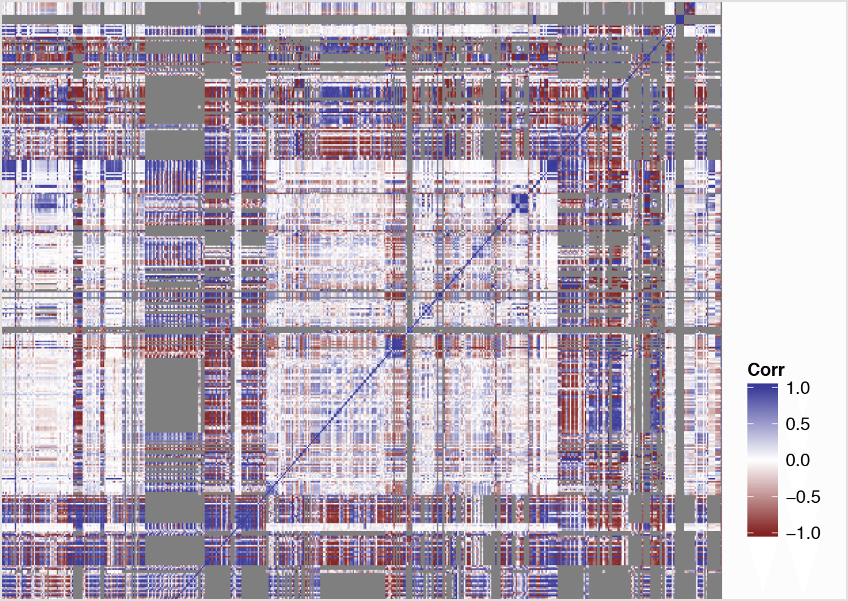
Sewing together a correlation quilt
From the start, we knew that wrangling all of the available data would be a significant task. We started with over 550 irregularly-formatted data sets covering a range of 18 different indicators of human well-being across countries and regions of the world. After a series of complex data transformations using R to clean up and standardize our data sets, we were able to explore relationships between the human development indicators.
We knew these data sets were hiding compelling stories, but didn't yet know how the data was related to itself, and which stories would best be displayed in visual form. In order to help determine which human development indicators would be most worth highlighting within the website, we mapped all of the data into a correlation matrix, which generated correlations between every combination of data. We then took this one step further by visualizing this with a correlation quilt.
Our correlation quilt enabled the Cato Institute to better understand which data sets were strongly correlated, and helped drive the data visualizations shown on HumanProgress.org. Additionally, we trained the Cato Institute team to use Google Refine to further explore and understand their complex data.
Project Statistics
At time of launch
-
2,268,162
Current Points of Data
-
556
Original Unique Excel Files
-
424
Dynamic Visualizations
-
95
Static Visualizations
-
18
Categories of Human Wellbeing
Making Complex Data Simple and Beautiful
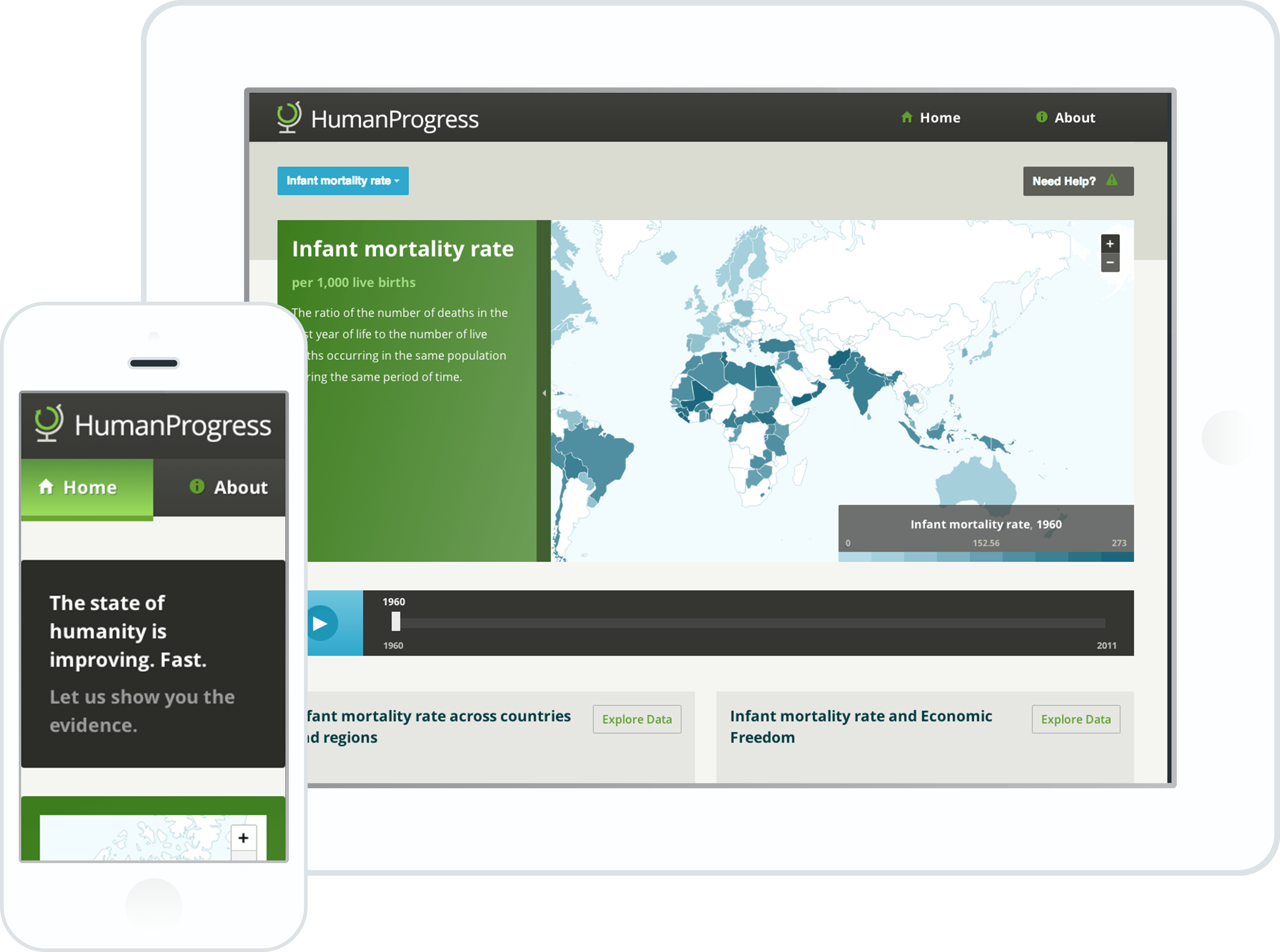
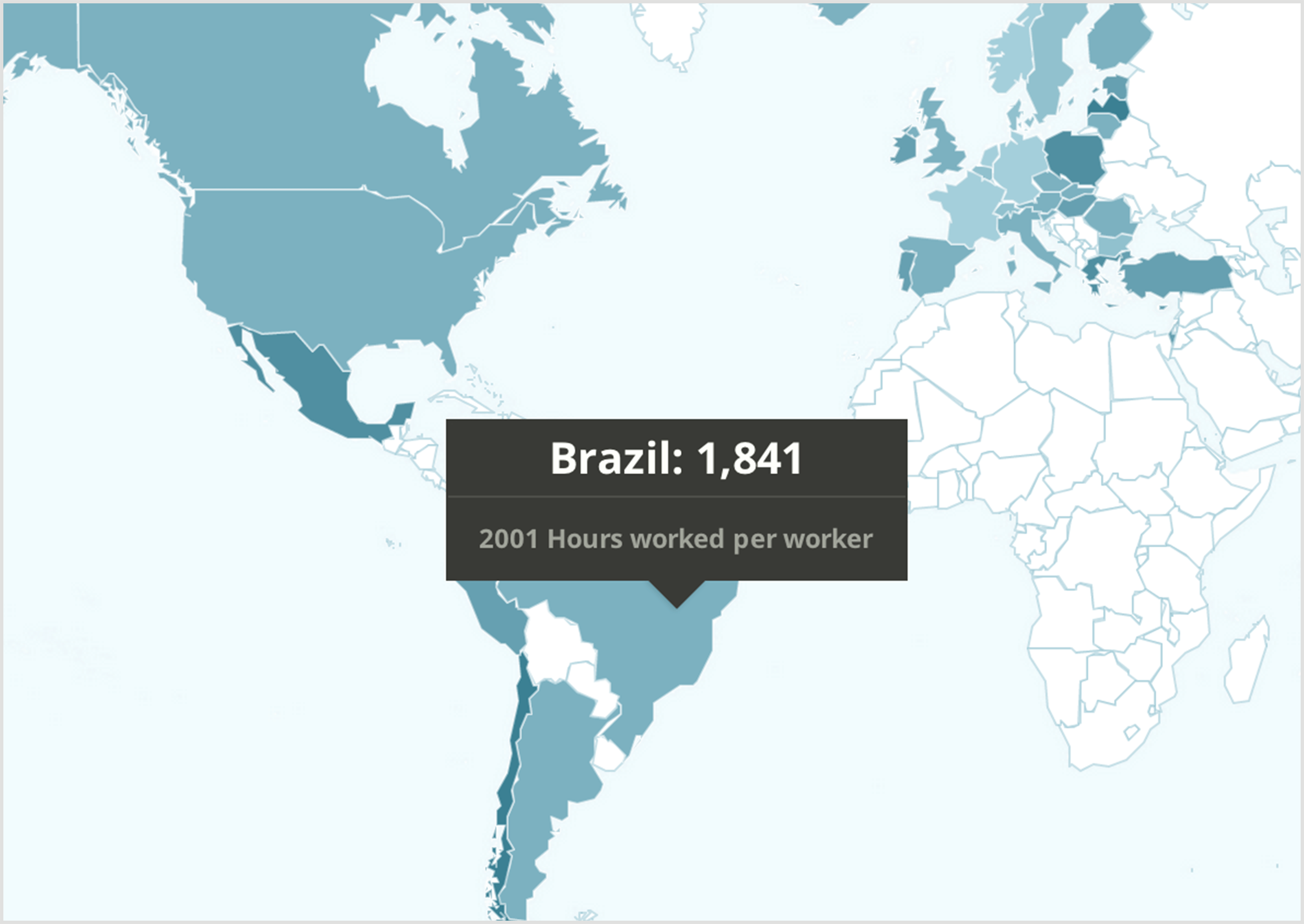
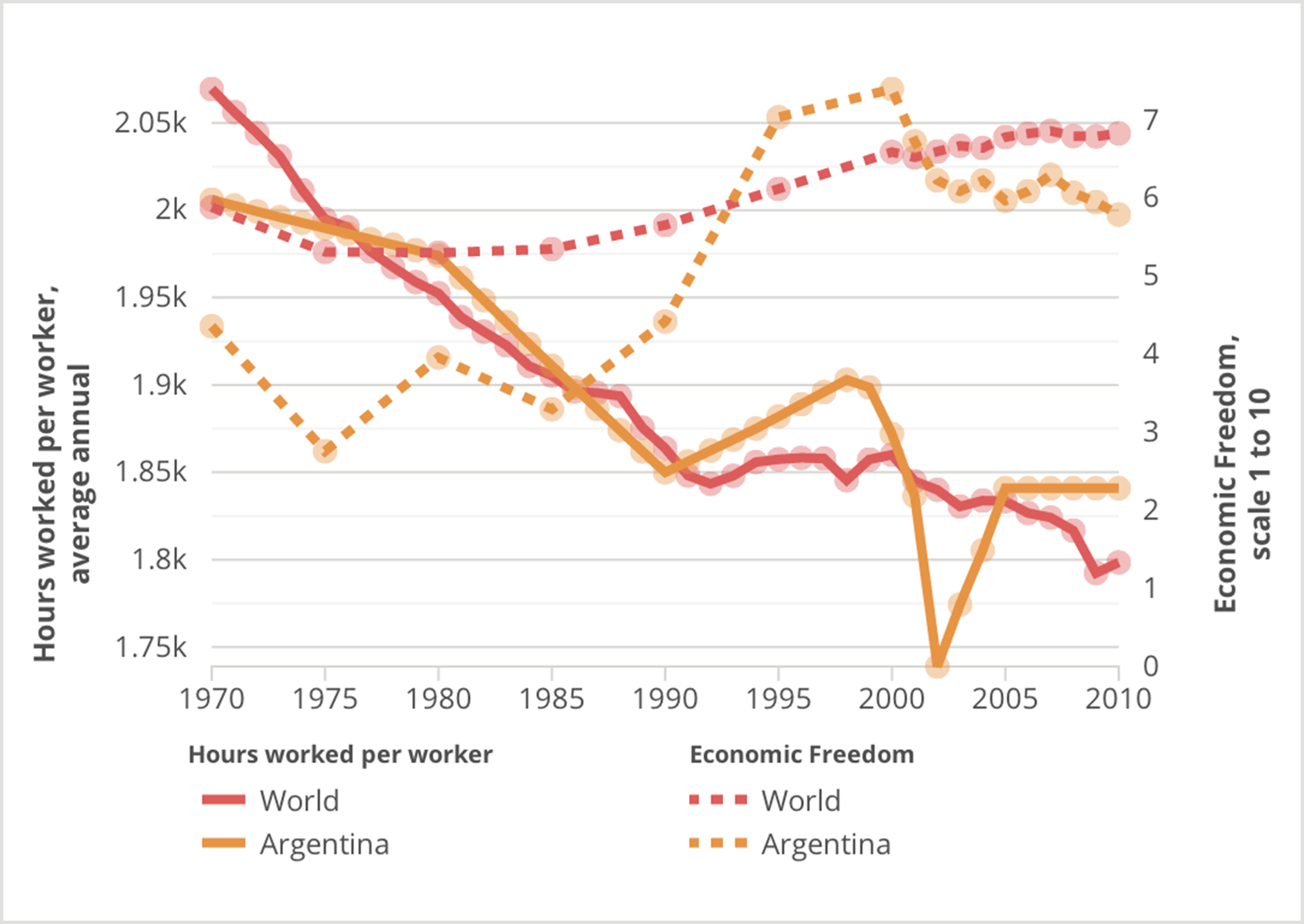
Now having a clear understanding of our underlying data sets, it was incumbent on us to find beautiful and simple ways to visualize this data. A combination of choropleth maps, line and bar charts, and simple, summarized statistics enabled us to do this elegantly—even across widely-varied data outputs.
Most of the visualization display a range of data over countries and years. With this data we're able to create an animated map to show human development indicators for countries across the world as they change over time. Additionally, users can compare the rise and fall of human development indicators with a country ranking tool.
We were able to achieve these great visualizations through the strategic use of several JavaScript libraries including Mapbox.js, D3.js, Backbone.js, and Marionette.js.
Breaking New Ground for Visualizing Human Development Indicators
In the past, many websites chose to visualize human development indicators using Adobe Flex or Flash. We were fortunate to be working with a forward-thinking client like the Cato Institute, allowing us to build in HTML, CSS, and JavaScript. The results are a responsive data-driven website that works well across platforms and browsers.
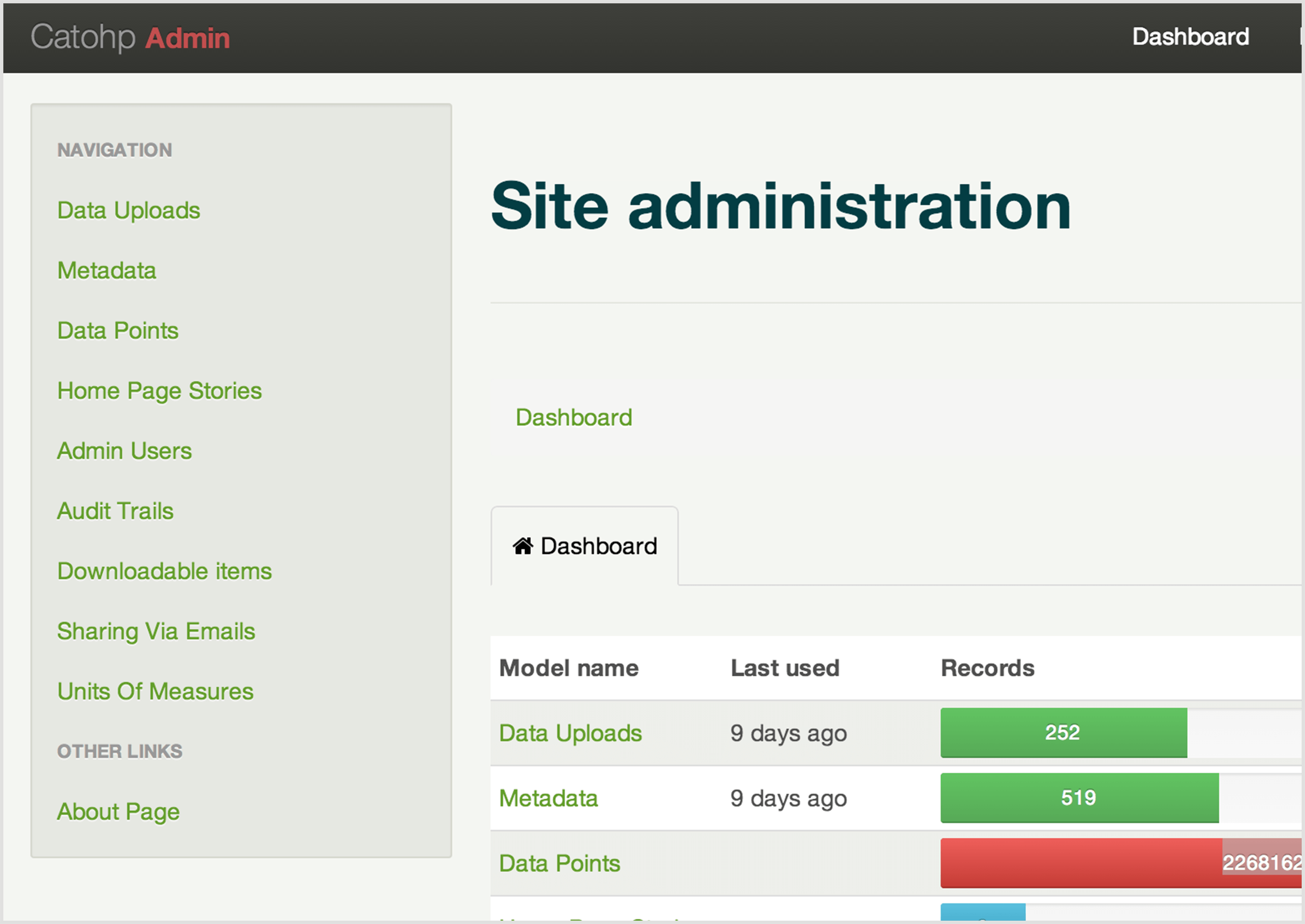
This is now the best source of human development indicator data on the web, and since we also added the ability to export the maps, charts, and raw data, these data and visualizations are freely available for anyone to use and analyze.
Project Needs:
Data Science, Rails, Data Visualization, User Experience, Human Development Indicators
Key Technologies:
Data Science, Rails, Data Visualization, R, User Experience, Human Development Indicators
